Hockey Ultimate Team (HUT)
Hockey Ultimate Team (HUT) is a game mode that allows you to create your fantasy lineup and compete online against other players from around the world or play offline. The mode also features Live events that mirror the NHL season schedule for users to participate in and unlock rewards.
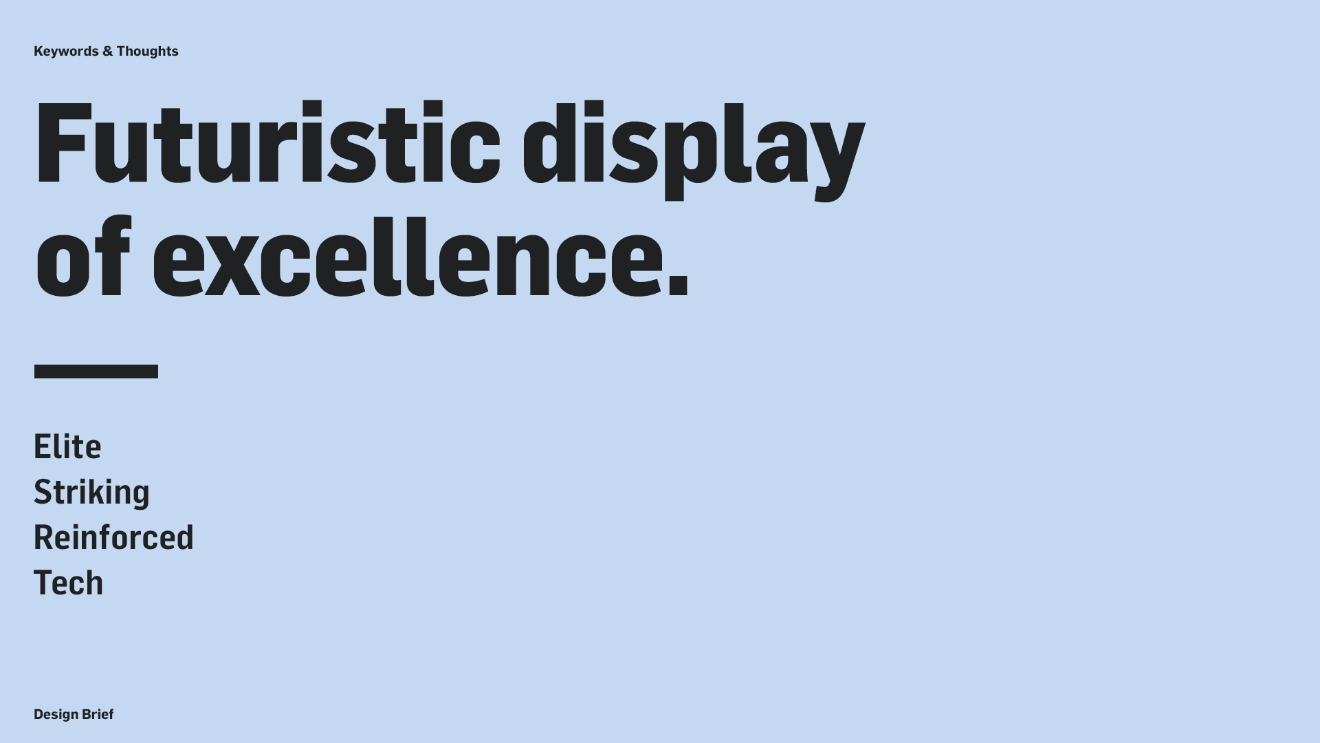
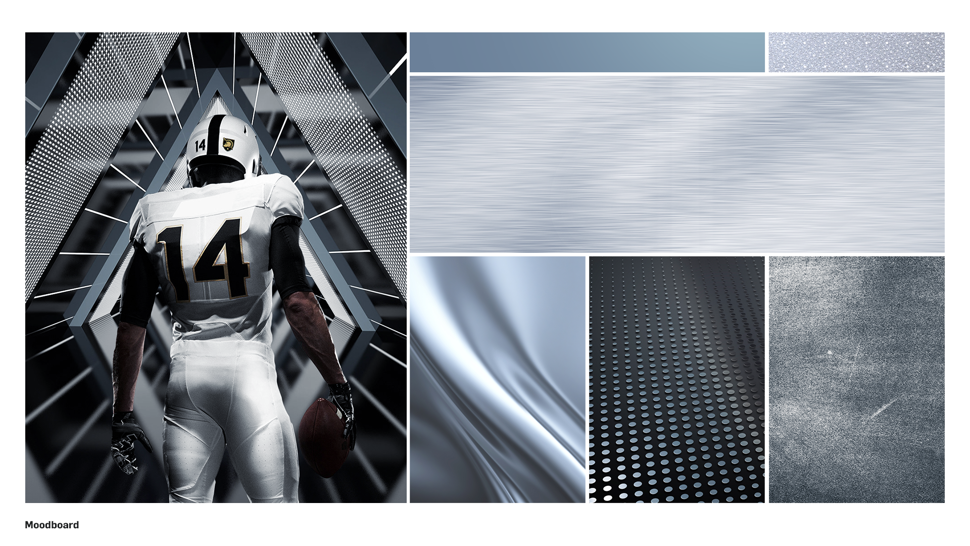
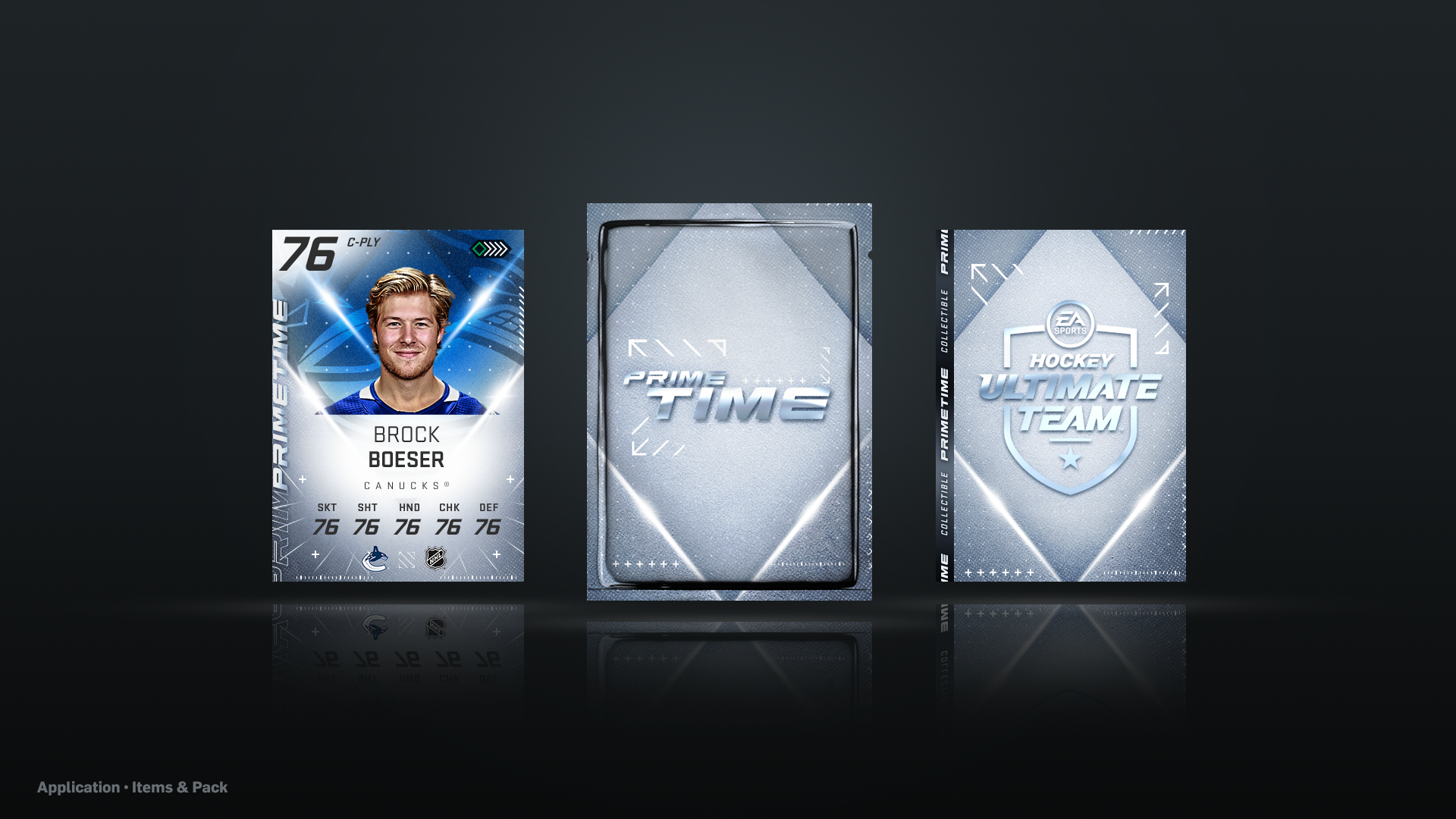
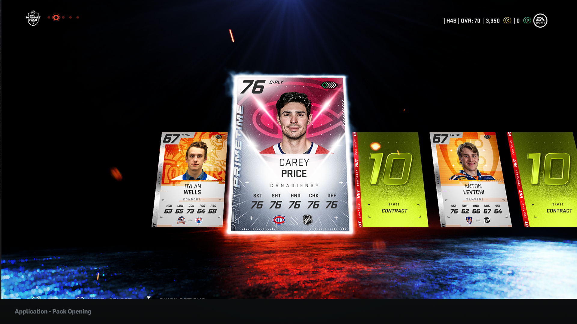
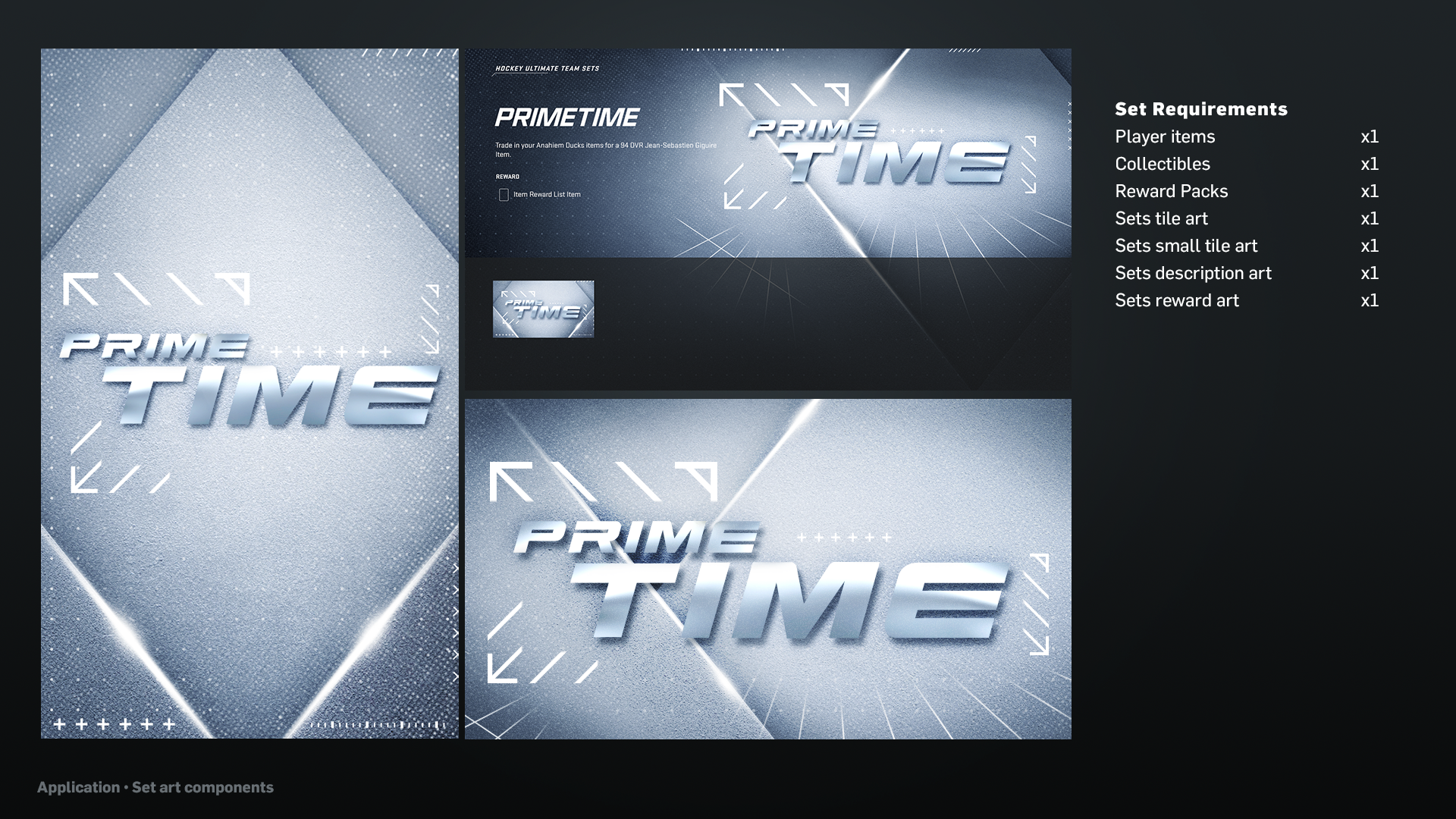
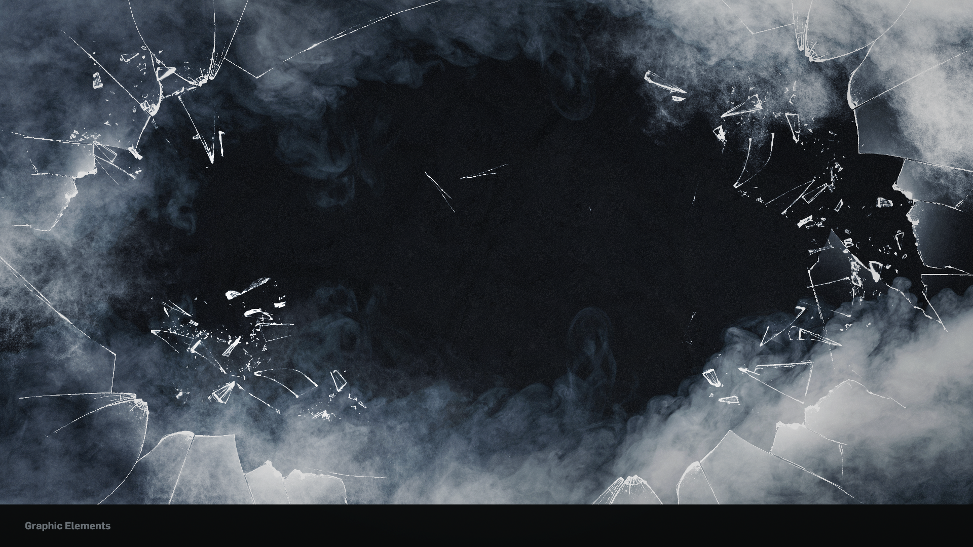
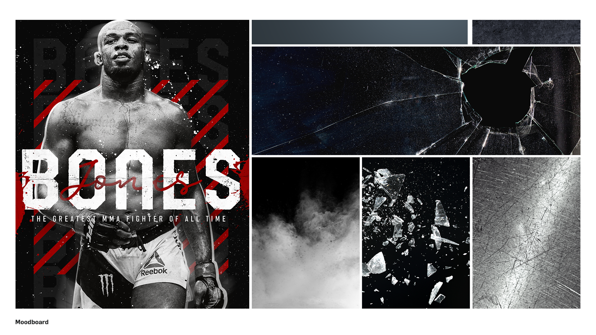
My main role on this feature was to develop and execute conceptual artwork for Live events that were happening throughout the NHL 19-20 season. The design process started with the Game Producers and I working to establish the art direction for the event. I developed concept statements, keywords, and moodboards while referencing any graphic elements or imagery that helped us communicate a brand identity to our users.
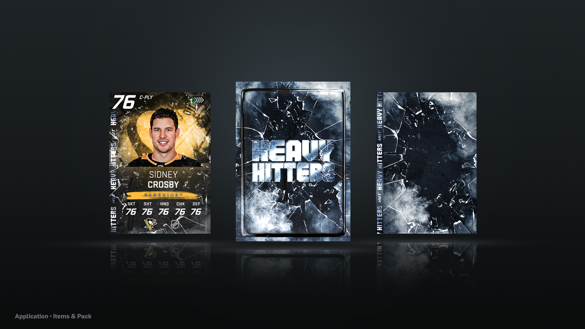
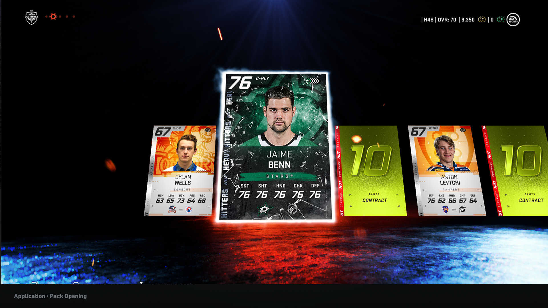
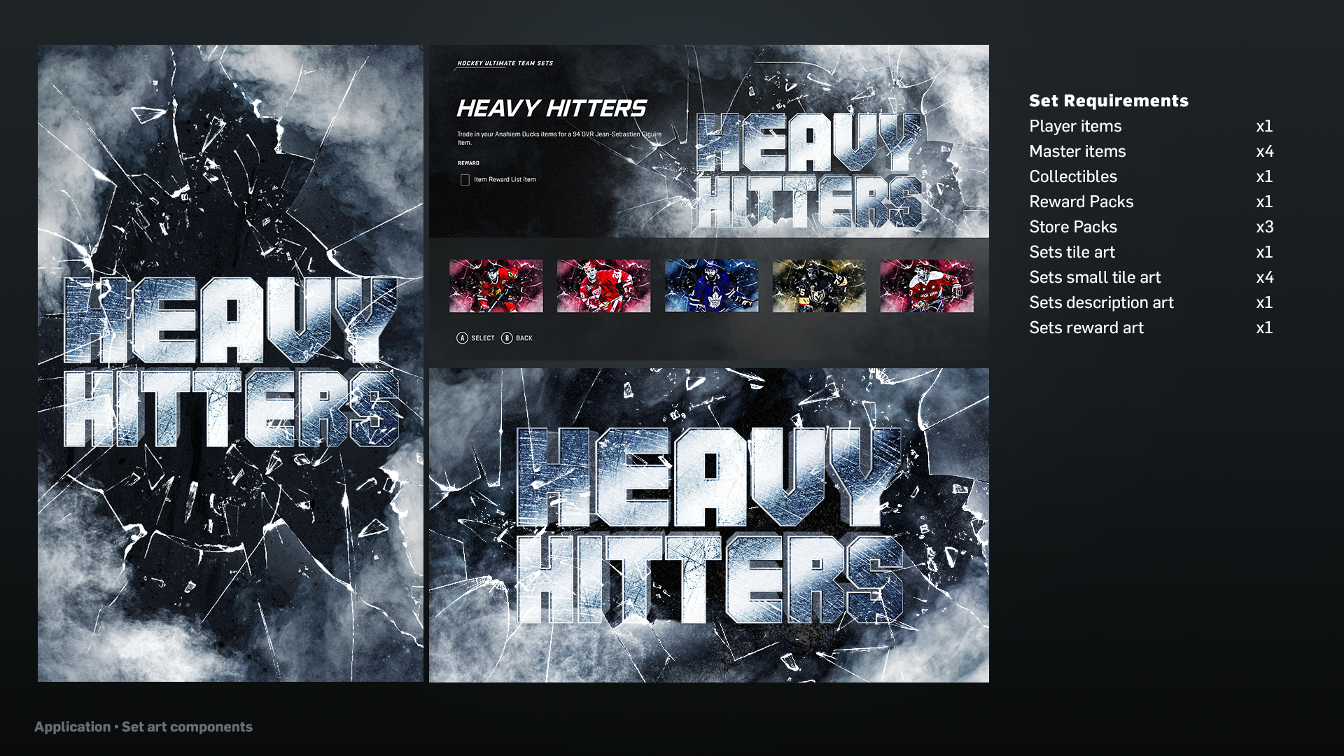
After getting alignment with my seniors and Game Producers on the research and references, I started exploring design solutions to apply onto in-game applications such as player cards, collectibles, reward packs, or screen backgrounds. With each event, we had to go through multiple rounds of iterations and feedbacks before finalizing on our deliverables.
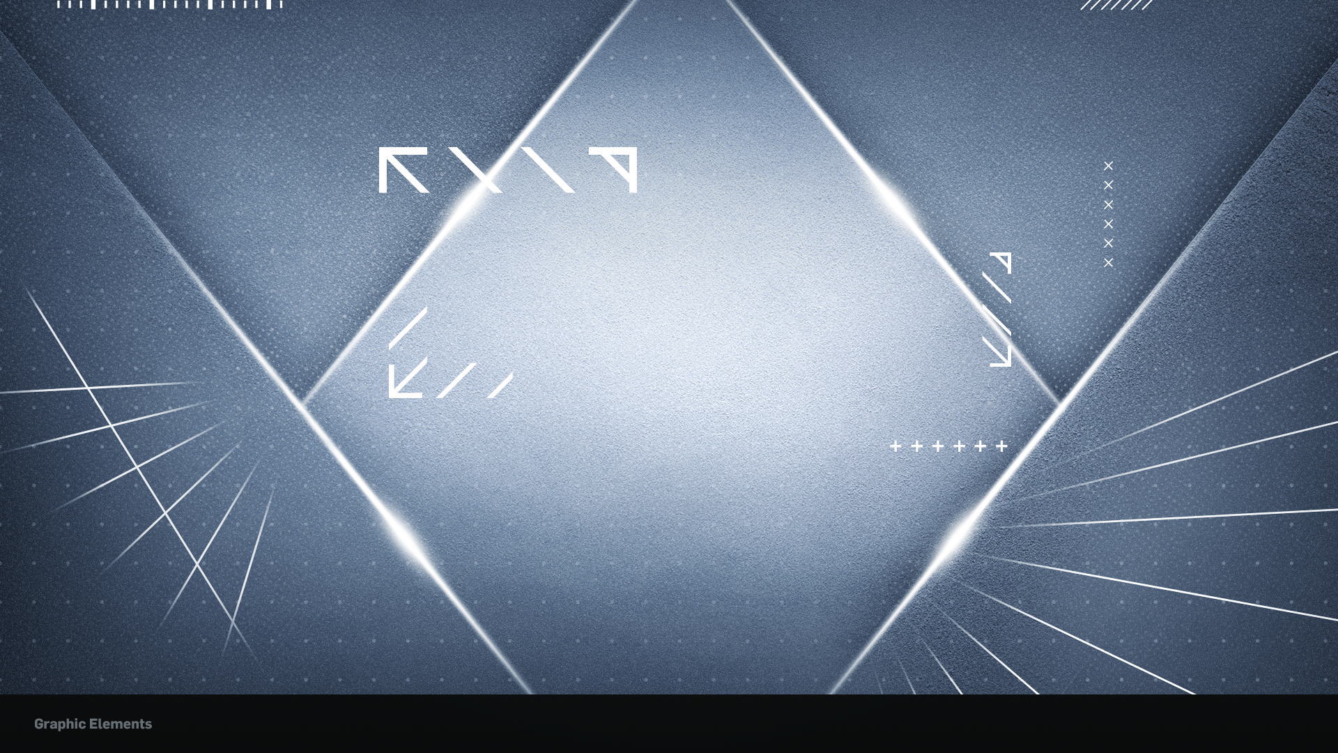
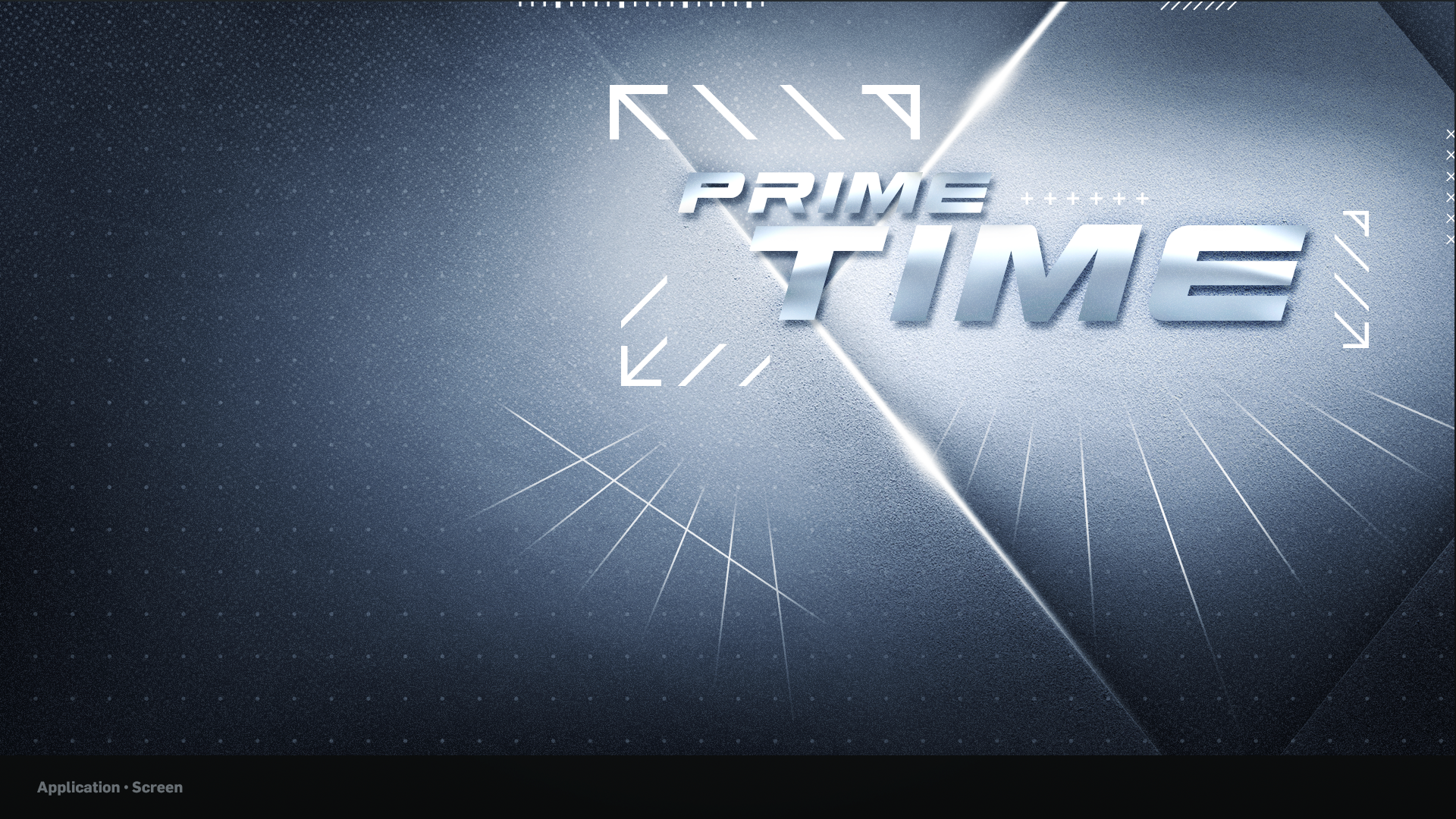
Primetime - Live Event Artwork
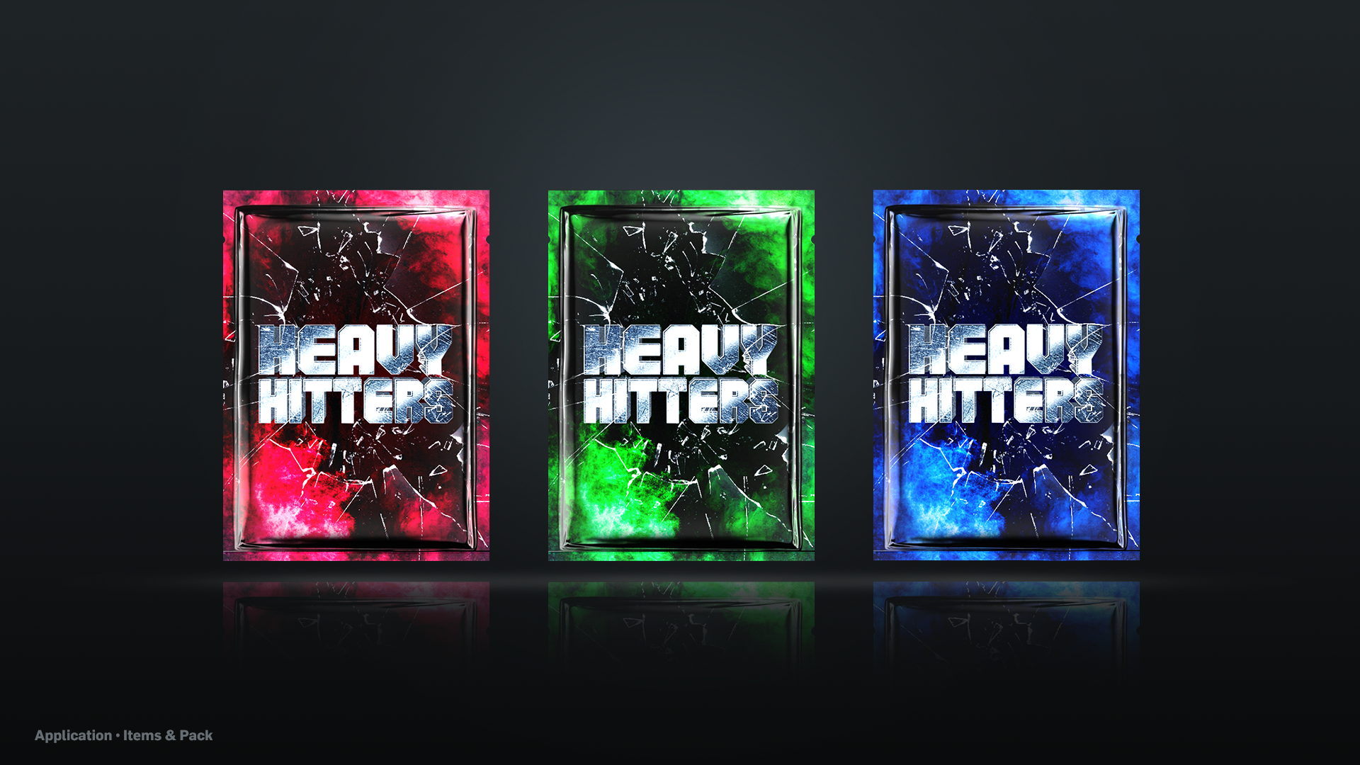
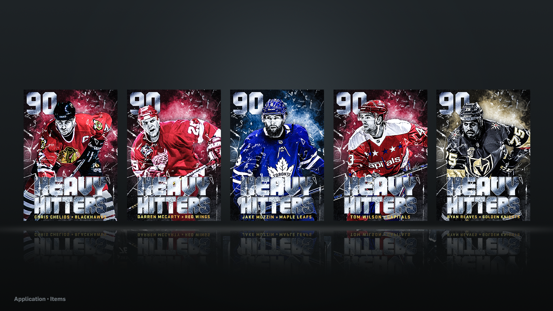
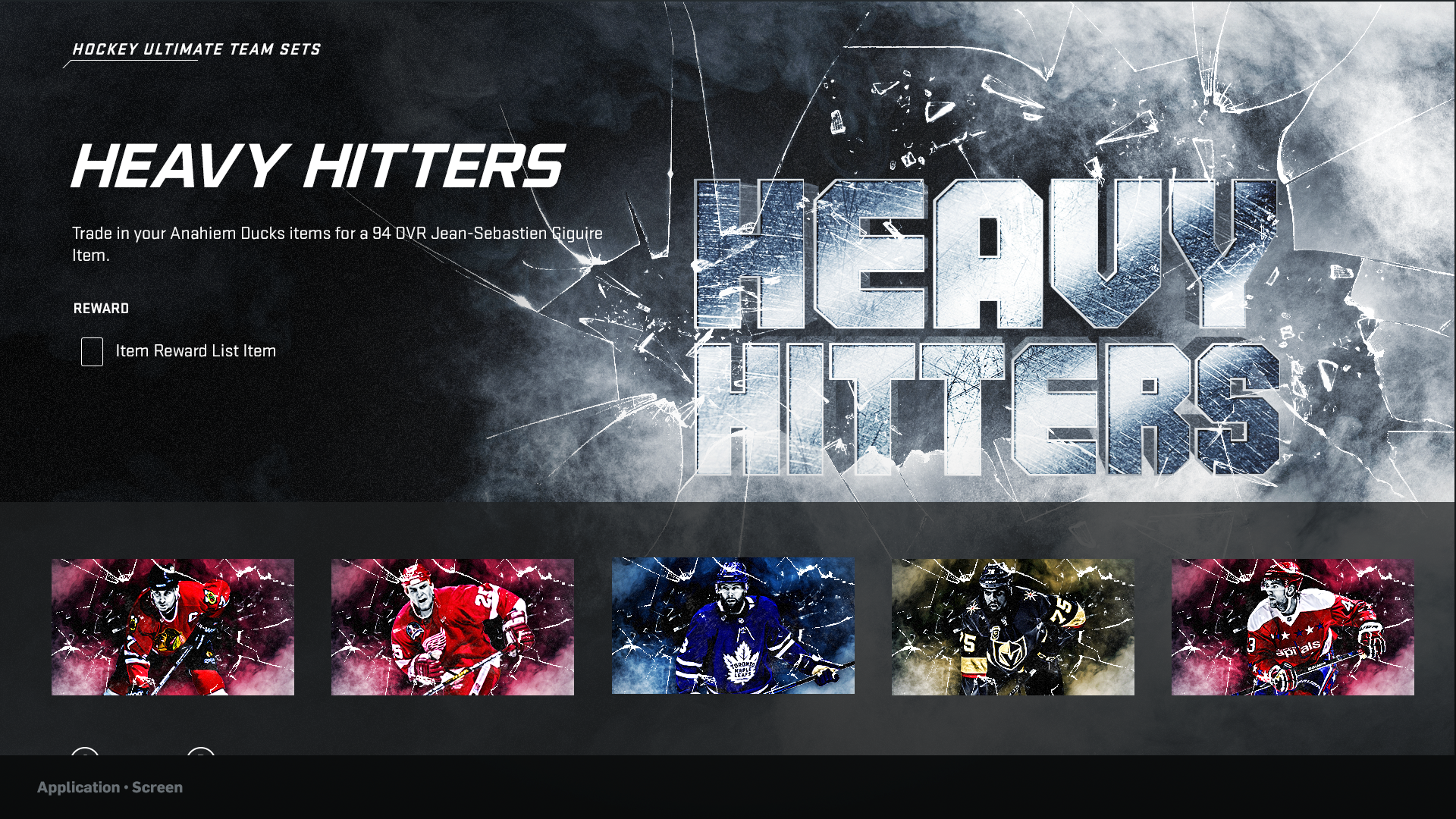
Heavy Hitters - Live Event Artwork
HUT RIVALS
While working on the HUT feature, I was fortunate enough to also support my leads with some UI work for a new competitive online game mode called, HUT Rivals. The feature is a new online mode for users to compete at their own level, climb the ranks and earn exclusive rewards while also earning qualification for HUT Champions - a weekly competitive season that runs year round.
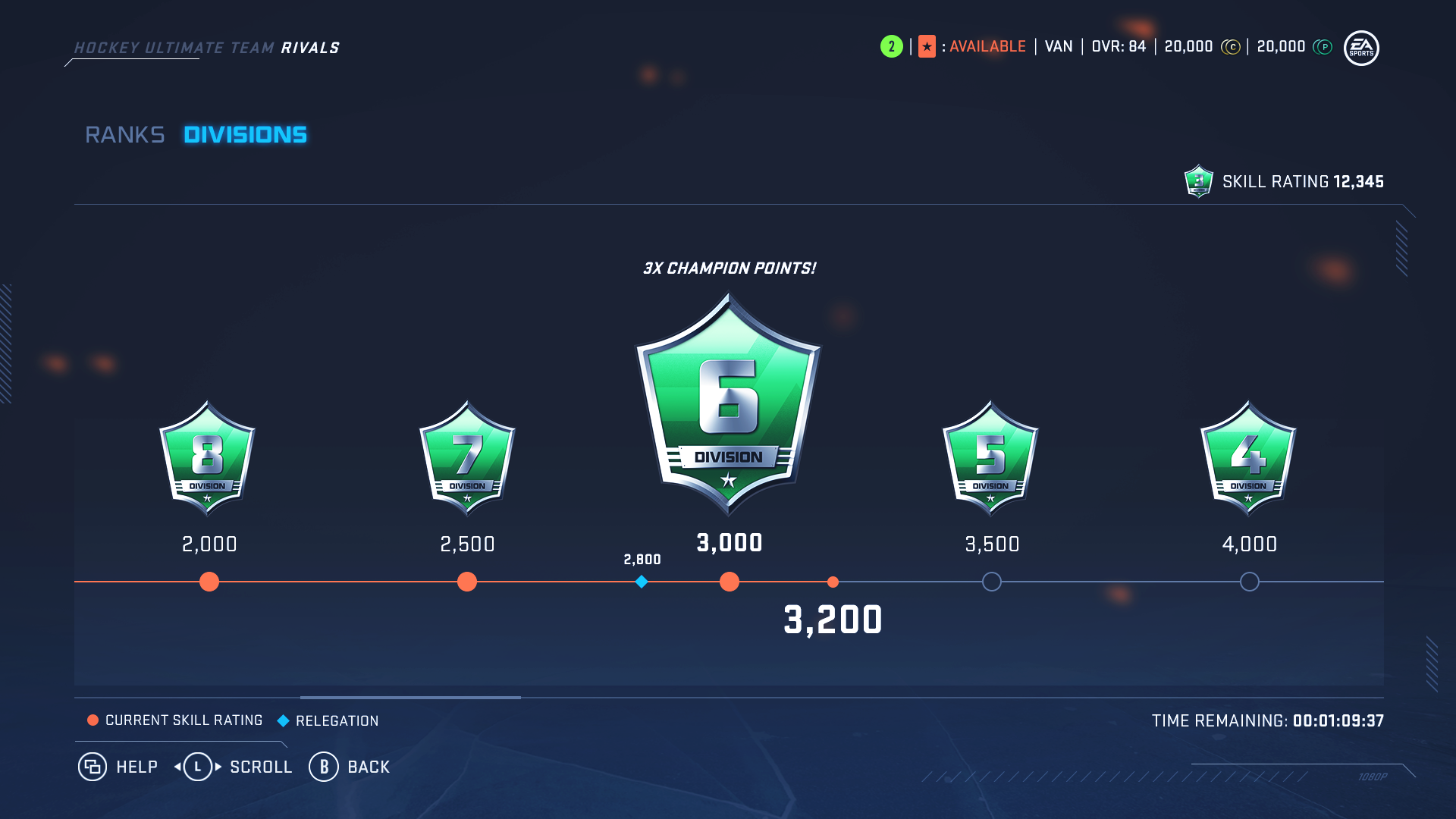
My role for HUT Rivals was to design the Divisions and Ranks progression screens. The focus of the Division screens was to have a resourceful and interactive diagram for the users to track their Skill Rating relative to their Division progression.
HUT Rivals - Divisions Screen Wires
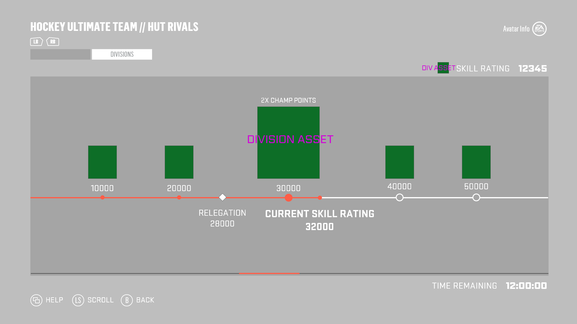
My primary concern with the wires, was the information highlighting the user’s Current Skill Rating and Relegation point. The team and I were considering how the legibility of the information around the diagram would be affected in instances where the user’s Current Skill Rating and Relegation point would get close to each other.
HUT Rivals - Divisions Progress Mocks
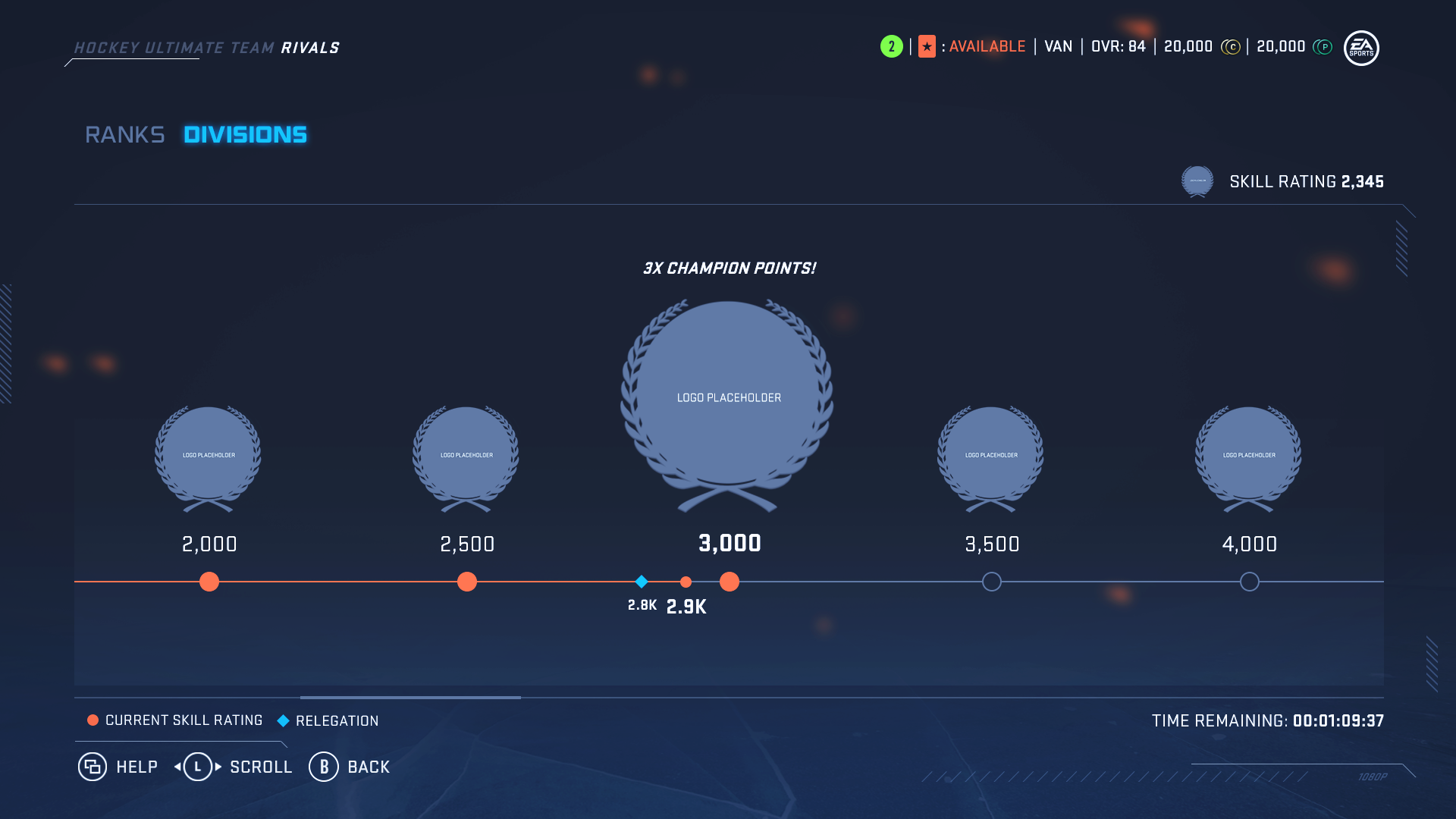
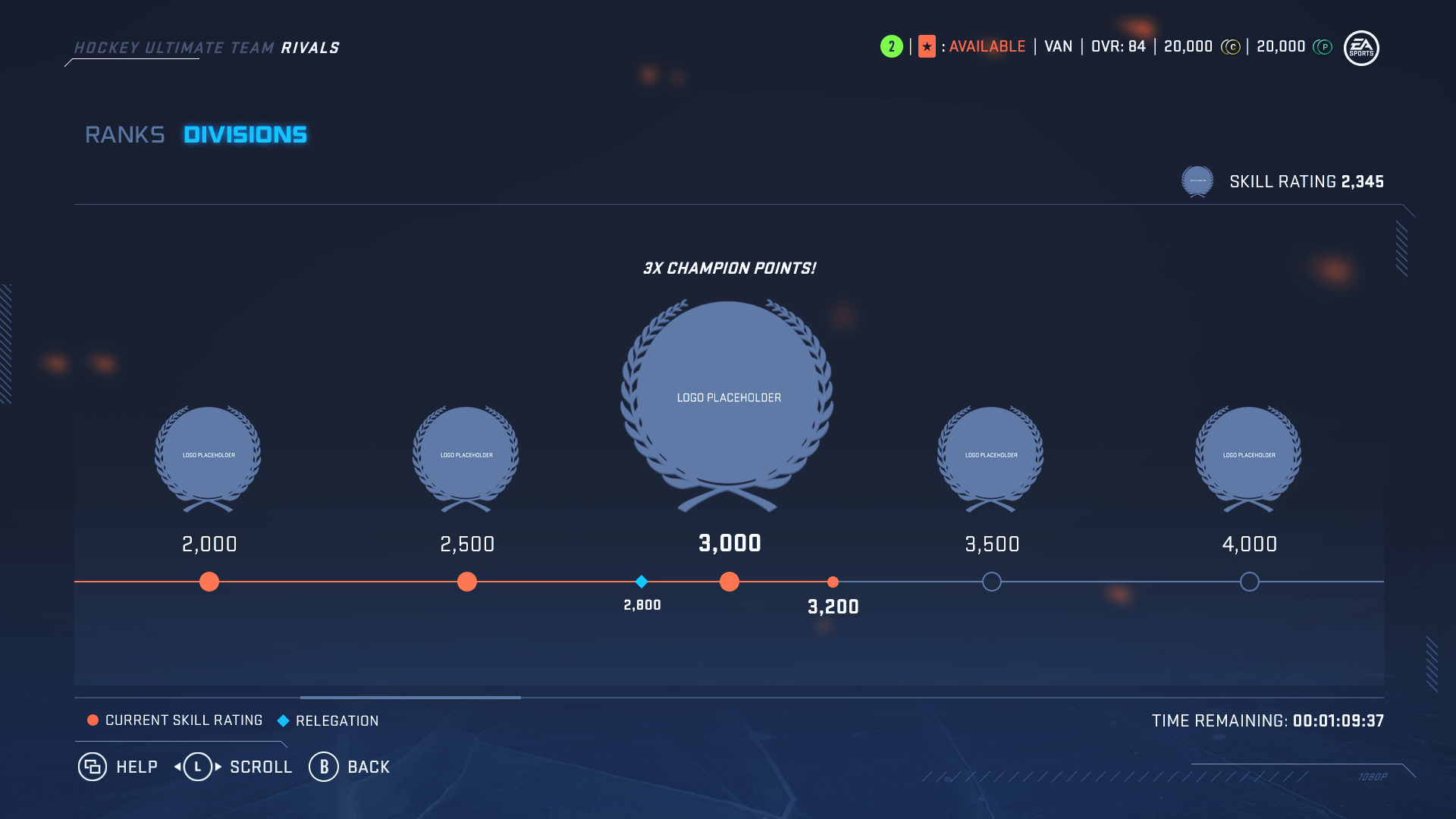
I explored several solutions where we could either abbreviate the number values or scale down the text to prevent legibility issues. However due to technical restrictions and design preferences from the rest of the team, I decided to remove the information headers and place the Relegation information above the diagram while keeping the Current Skill rating point at the bottom and use scale to give hierarchy. The reasoning behind this was because, the screen already has a legend (bottom left) for users to refer to, and by enlarging the Current Skill Rating information we could encourage forward progression to our users rather than being mindful of a relegation point.
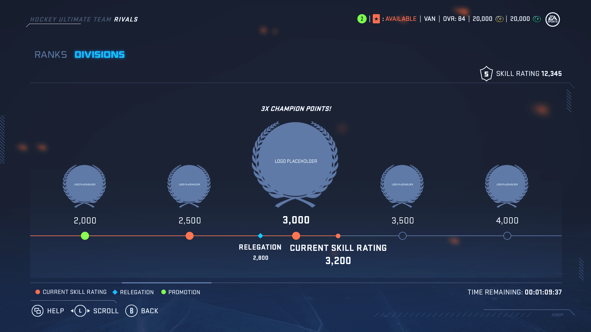
HUT Rivals - Divisions Final Mocks
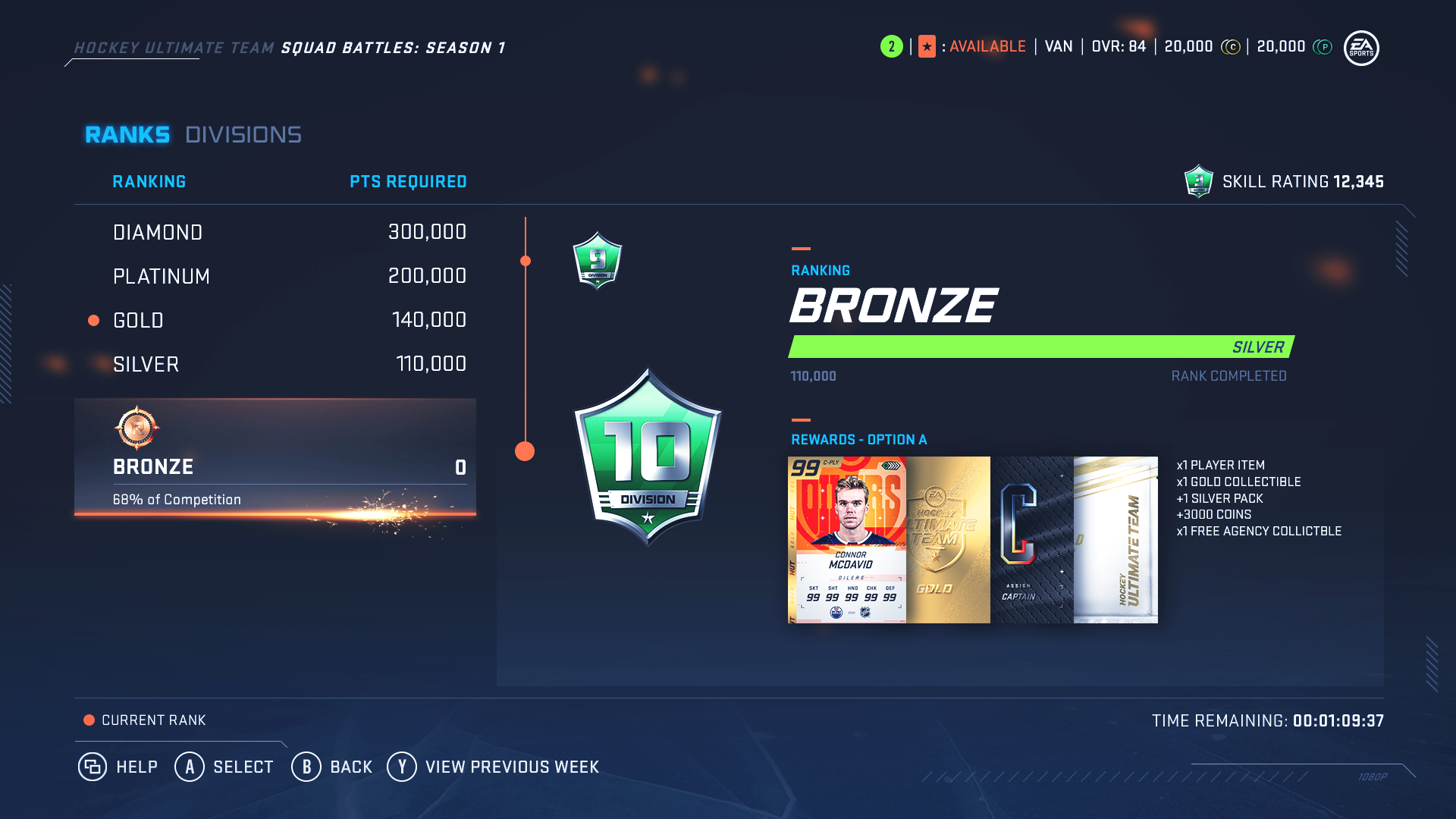
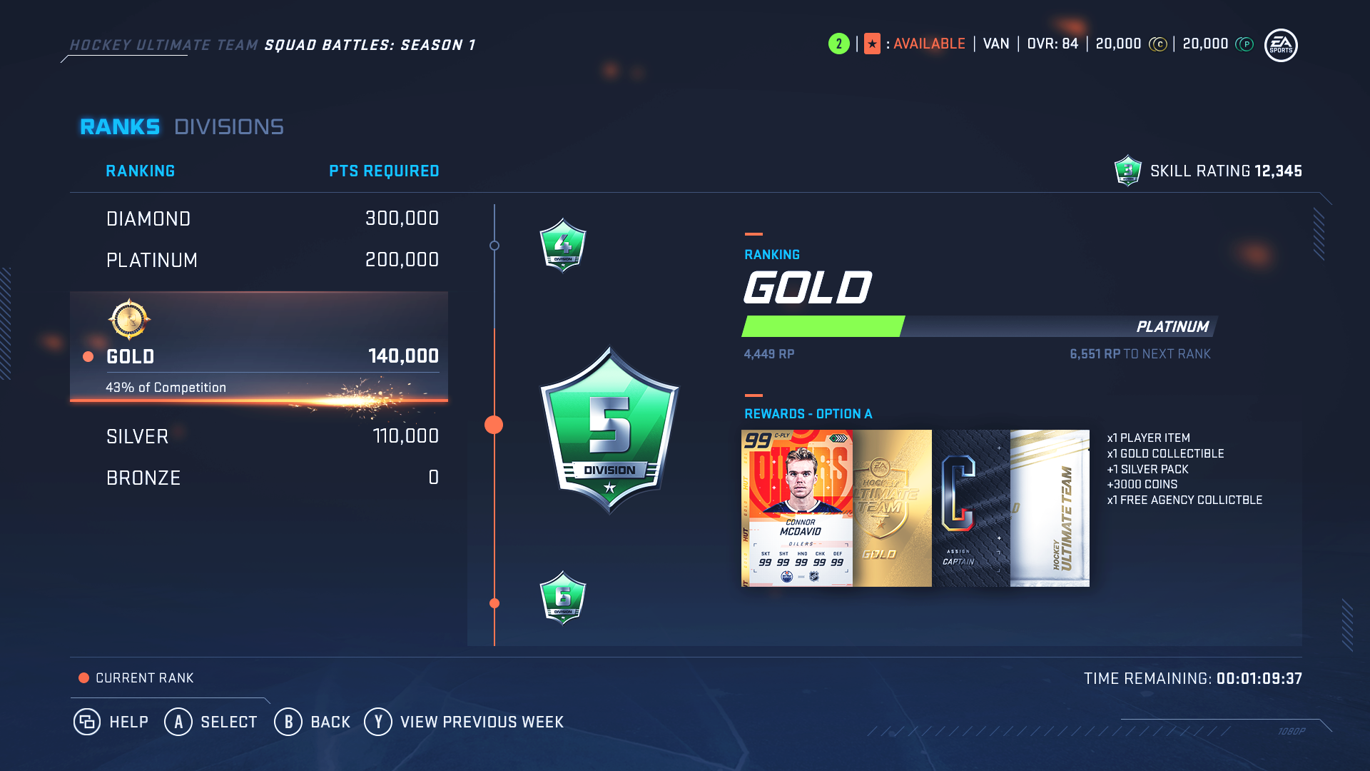
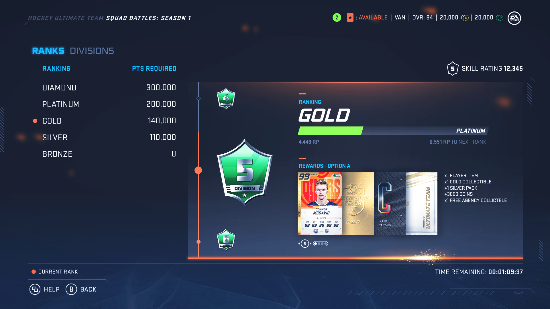
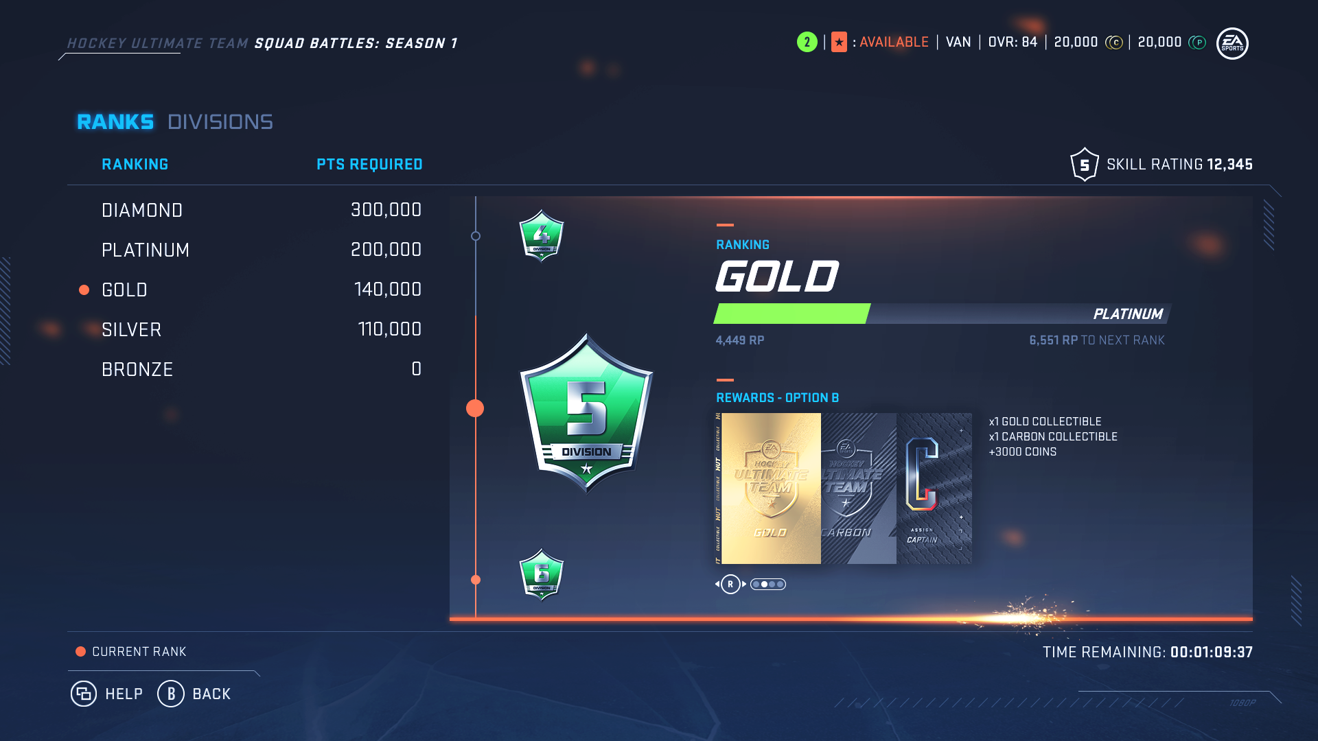
The focus of the Ranks screen was to have user’s toggle through the different ranks to view the Reward options they would be able to achieve at that rank level.
HUT Rivals - ranks wires
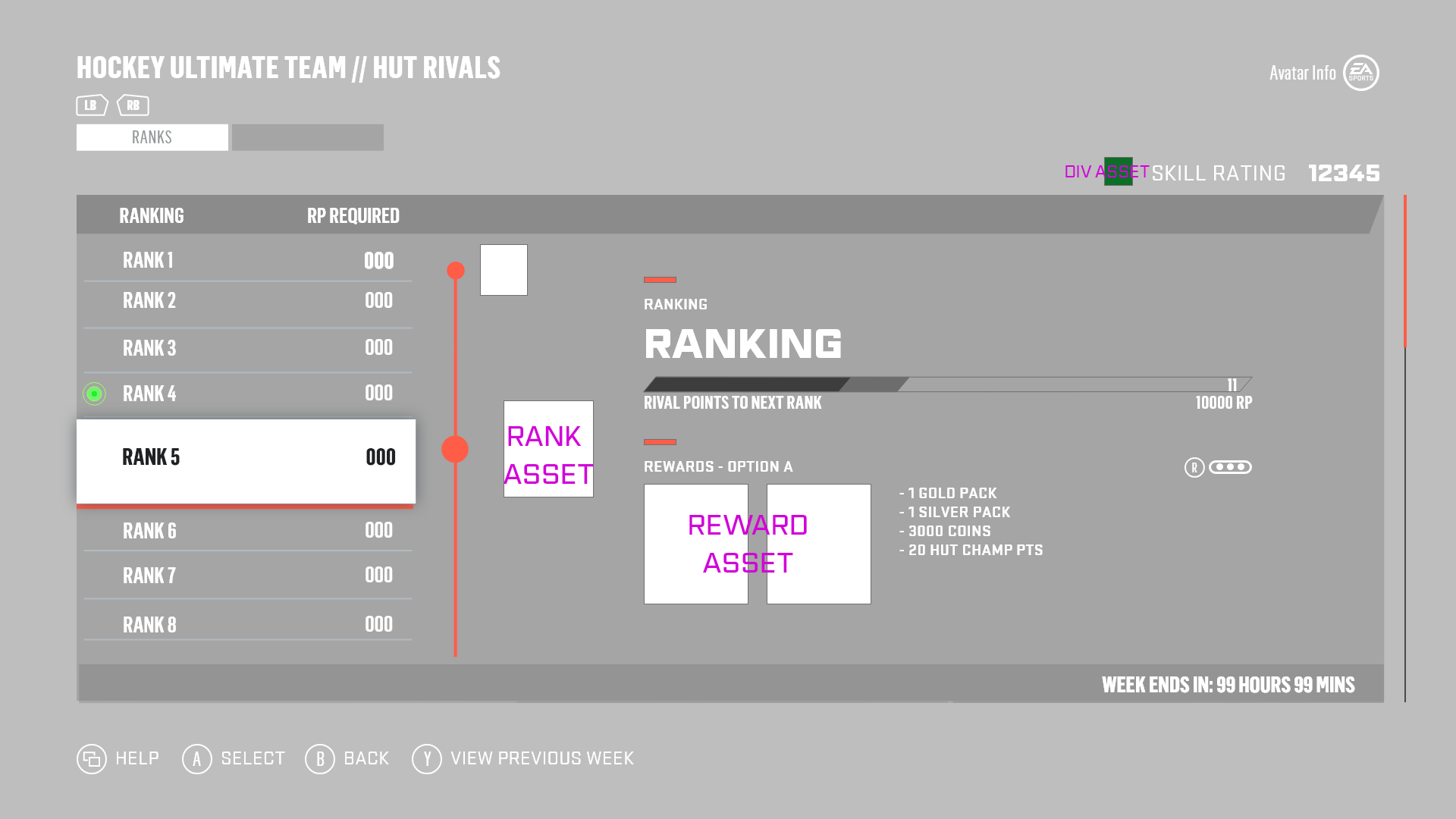
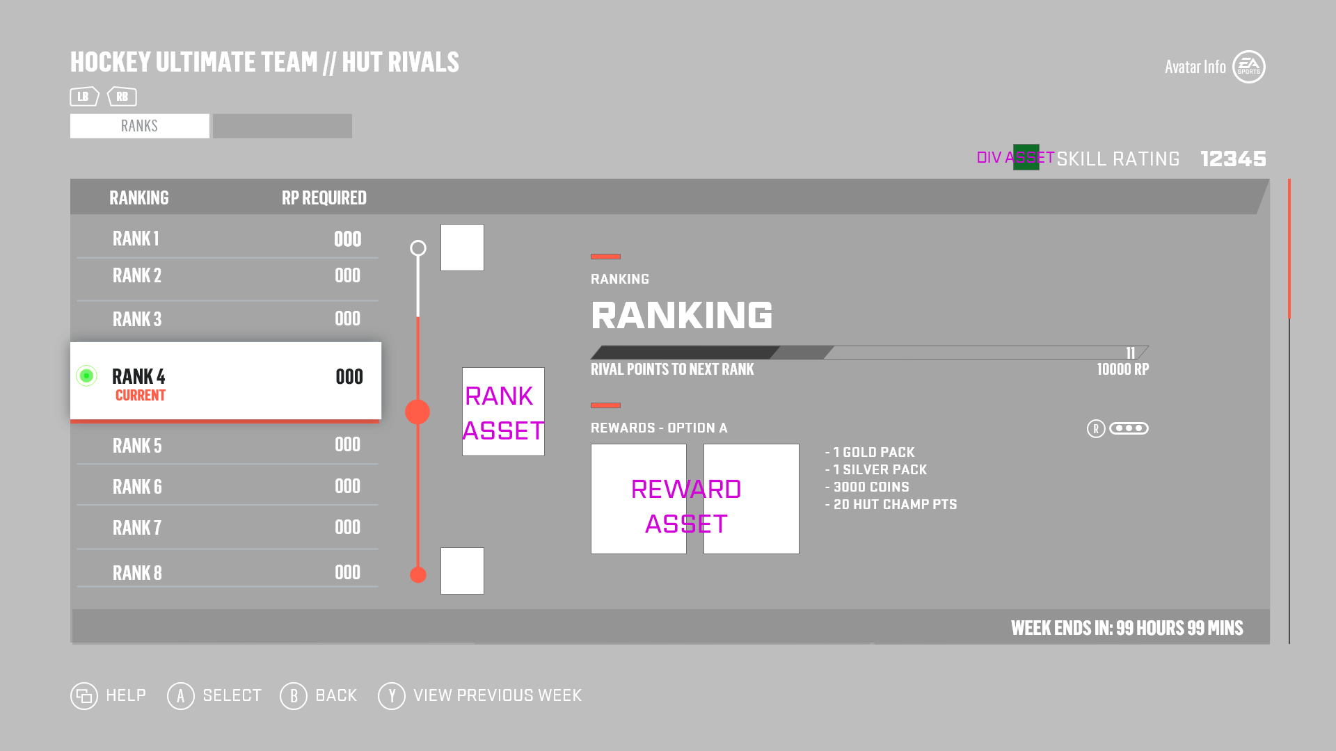

Upon receiving the wires for the Ranks flow, the interaction for the user to view their Reward options was still to be decided. While the wires only highlighted an interaction on the Rank selection, I suggested we could have an interaction with the right portion of the screen so users can toggle through the Reward options but also be mindful to not overload the user with new functionality.
HUT Rivals - Ranks Progress Mocks
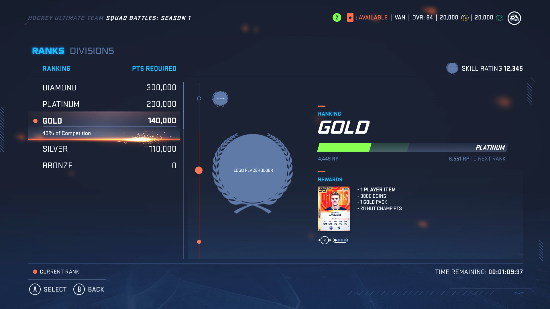
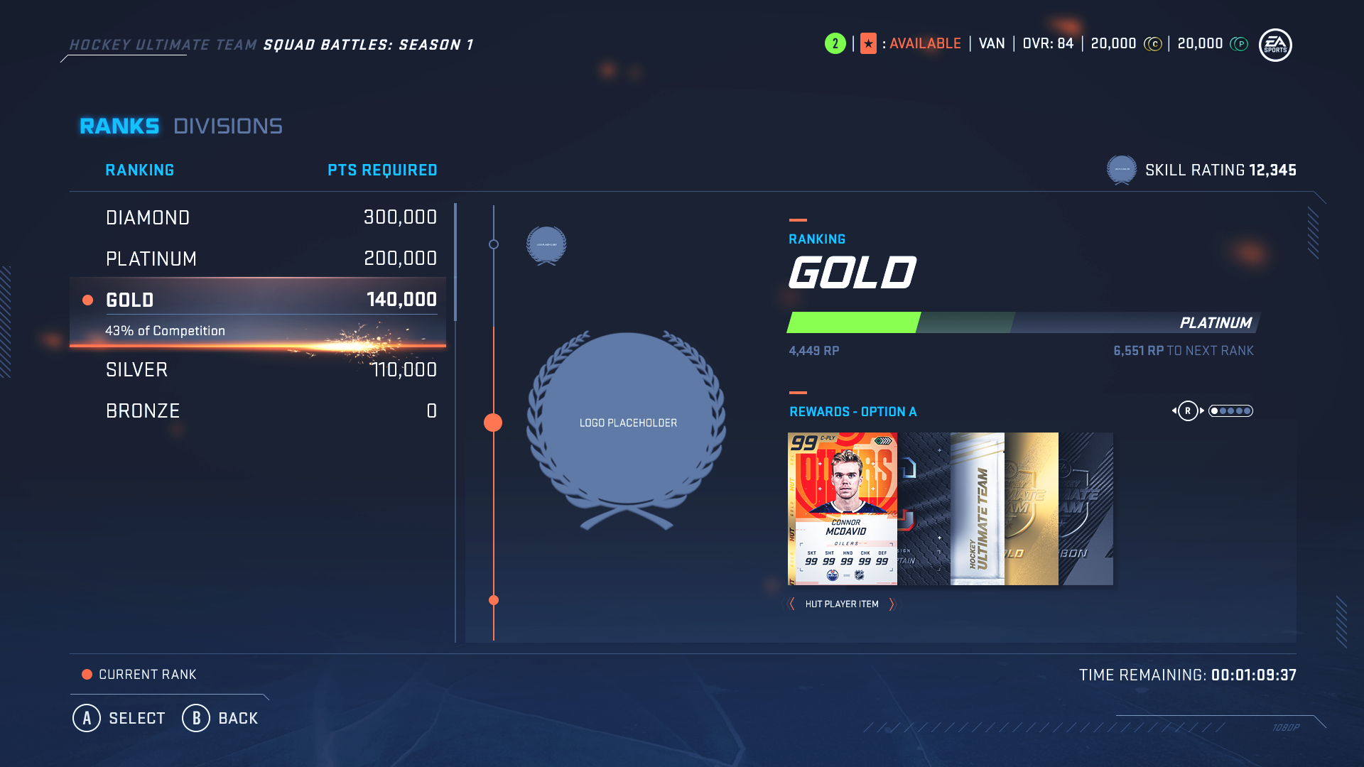
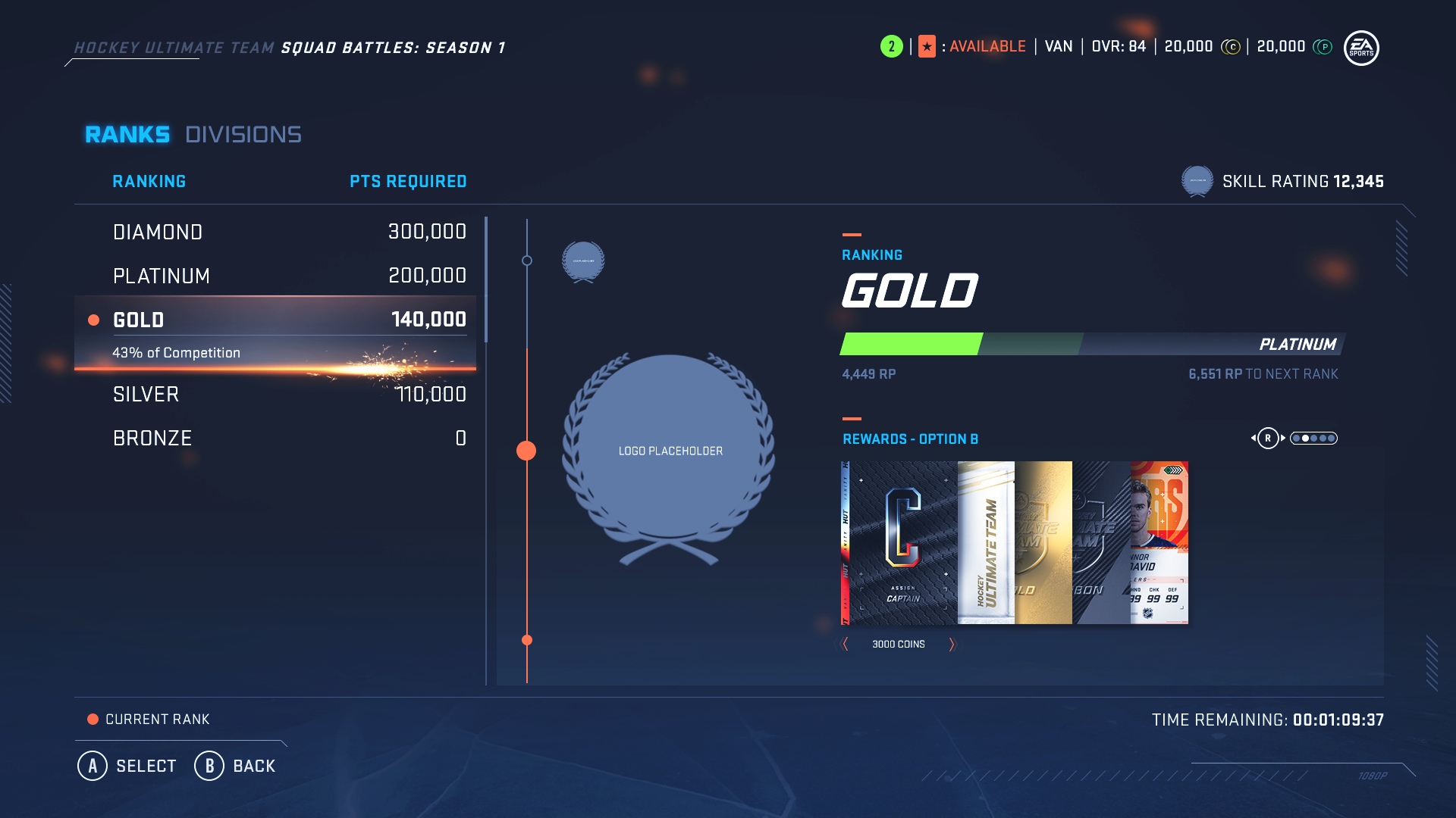
I tested out some designs for the interaction with the right side of the screen, but I still had to determine the UI treatment to indicate the user’s shift in focus on the screen and also a preview system for the Reward options and description text. After working closely with the engineers to determine what our technical limitations were, we decided that all interaction shifts to the right side of the screen as soon as a user selects into a Rank. From there on, we designed a semi-stacked arrangement for the Reward options, and have the description text set to a fixed width from the last Reward item in the bundle. While the user has selected into the Rank, they can toggle through the Reward bundles with their right stick, and then back out of the selection to scroll onto other ranks. We felt like this was the most effective solution that would not require the user to do too much while scrolling through the ranks, but also provide them the option to select into a new interaction with the right side of the screen.
HUT Rivals - Ranks Final Mocks